CASE STUDY: UI DESIGN
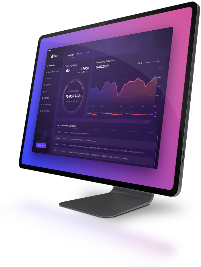
ROUTER INTERFACE
Redesigning the user interface of a WiFi router software for IT company hpc24.
Before the actual project kick off, the client and I had a Zoom meeting discussing the general scope of my work and other fundamental points I needed to know in order to start my work.
The Client
hpc24 - a german IT and telecommunications company.
The Product
A new router software interface they are currently working on.
My Role
Designing the new UI - no changes to the underlying software structure.
Project Scope
About 20 screens including buttons, modal windows and diagrams.
The task: making the UI more accessible for non-tech users.
GOAL POSTS
In our first online meeting, the client and I talked about the task and the goal hpc24 wanted to achieve with the new UI of their router software. When it comes to UI as well as UX design, this early phase of the project is quite fundamental: recognizing the existing problem and defining an effective solution.
The Problem
The current user interface of their router software has been identified as too technical and therefore rather intimidating for many non-tech users. It gives the user a lot of options to set up the router, which can be overwhelming for users who cannot identify which option is actually important and which isn't.
The Goal
The goal of our redesign was to make the UI less overwhelming and intimidating. It should look more modern and accessible. Most screens now have a reduced number of options, whereas more advanced ones will be shown only after clicking on the according button.
We Offer Awesome Services
Design
Lorem ipsum dolor sit amet, consectetur adipiscing elit. Ut elit tellus amet
Deploy
Lorem ipsum dolor sit amet, consectetur adipiscing elit. Ut elit tellus amet
Develop
Lorem ipsum dolor sit amet, consectetur adipiscing elit. Ut elit tellus amet
Support
Lorem ipsum dolor sit amet, consectetur adipiscing elit. Ut elit tellus amet